Quote:
|
Quote:
|
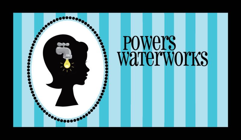
I like the drip/bulb idea - not a fan of the colors or the font, imho. Alot of dead space.
|
Whereas I love the colors and open space.
I like the design! |
Quote:
|
I'd extend the area if it wasn't the front side of a business card. ;)
But I'm glad to hear that the concept is coming across clearer in this version. It's hard to get something like that across! I really appreciate all of your feedback; it helped me arrive here. Kudos to Tom for brainstorming with me, and tossing out the light bulb idea. I want to live in his Clever-Cleverland. I understand about the open space - though I do like the fact that it's not crammed. I don't see it as "dead" so much as purposefully open. My personal information will be on the back, as is the recent standard for Creative (capital C, meaning "hire me for my creativity") calling cards. |
Have you considered merging the W's? Like the W in Powers with W in WaterWorks in a cross or + like pattern? ImHo. I think the deadspace would be lesser if the eyeline of the figure was even with the lettering. ImHo
|
Since I'm late to the game, the first picture/thought was "She's a drip". But, does anyone call a person a drip anymore?
I get the picture now. The look of it reminds me of a Victorian silhouette which is not an era I usually associate with you. But, I like the look of it. |
| All times are GMT -7. The time now is 01:23 PM. |
Powered by vBulletin® Version 3.6.4
Copyright ©2000 - 2026, Jelsoft Enterprises Ltd.