Option #4, with the word "Dynamic" in the font from Option #1.
|
I like the original or 4 - I voted for 4. Those two looked the most professional to me.
|
Yay for kerning!
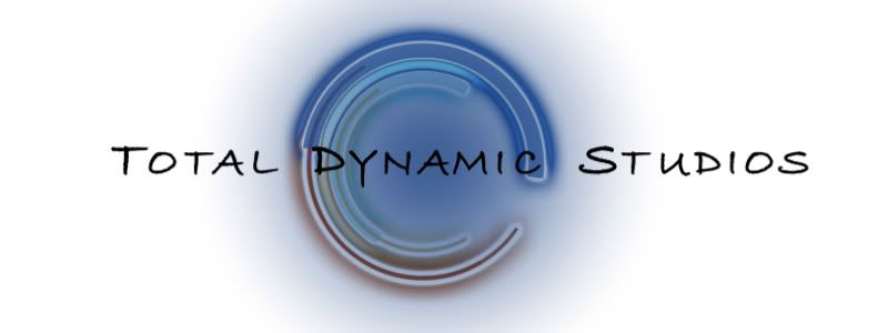
Though now the D in #1 is being severed by the multi-tonal background like the others (I think that's what my eye doesn't like) - but the shape of the D works much better than the other severed ones - so this is still my favorite. And also - I meant to say this before - yay for progress! |
I also voted for #4 because it looks more professional.
|
Quote:
|
Quote:
I'm seeing the same thing LSPE is seeing with the "D" in option 1. Actually, I notice it in most of them since the "D" is right on top of the logo like that, it really stands out more than the even the "T" and "S". |
Option # 2 looks like the font from "Friends" (the TV show).
My initial reaction on Options 2 & 3 is that if you are going to print (business cards), if you you reduce the logo, the fine lines of these type faces (especially in a reverse) will close up. |
Quote:
|
Here is Option 1 in "reverse print mode":
 |
Quote:
|
| All times are GMT -7. The time now is 02:11 PM. |
Powered by vBulletin® Version 3.6.4
Copyright ©2000 - 2026, Jelsoft Enterprises Ltd.