 |
Website Background
Hi everyone!
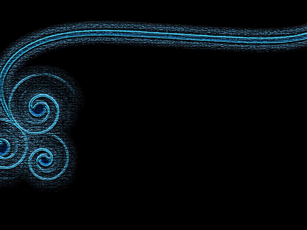
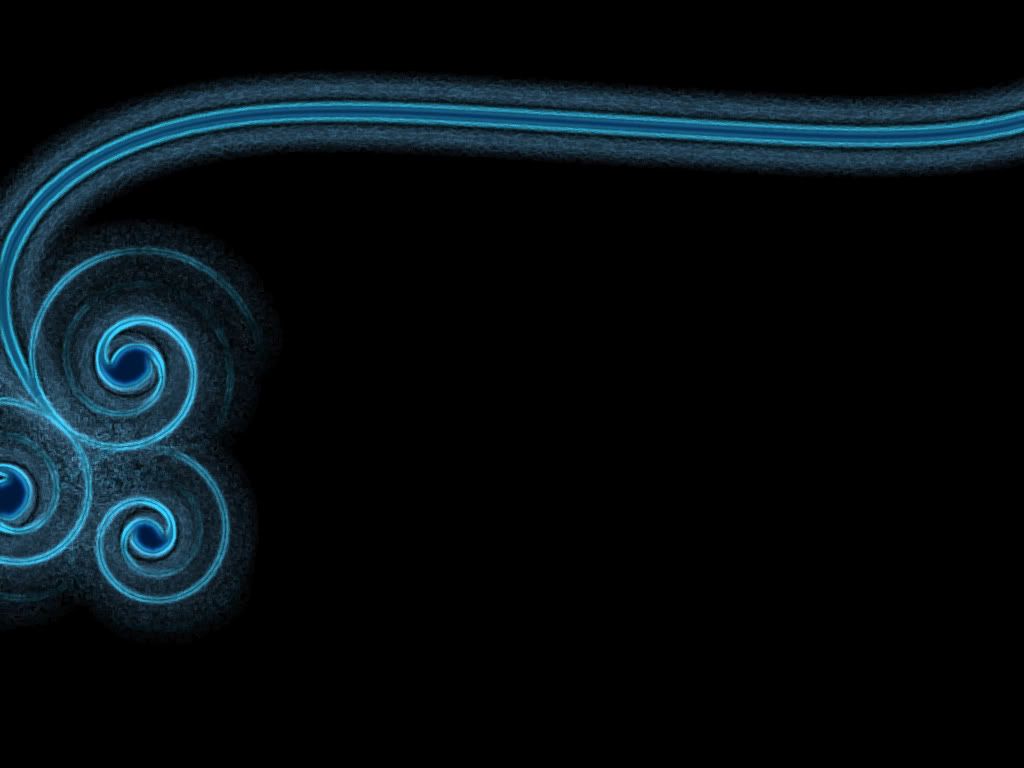
Please take a look at these two images and vote for your favorite. These are background concepts for my portfolio (www.teresawhitmore.com) site. Thanks! :)   |
I like the second one.
|
I like the second one too.
|
Numero dos
|
It might just be me, but they both look a bit on the phallic side.
|
Number 2
|
I like the second one better.
|
To me, the second one looks like the face of a surprised monkey on a string. This is not to say I don't like the second one better (but now that I've seen the monkey I won't be able to unsee it.
|
2
|
2
|
No crackle. I vote 2, too.
|
I like #1 because of the texture.
|
I'll go #2
|
I like them both, but the second one - that I admit I found initially more appealing - looks like what you see everywhere - very smooth and digital. The first one's texture effect makes it look less common, i.e., much more distinctive and unusual - but still retains the beauty of the design. My vote is for No. 1.
|
Are the backgrounds going to be as large as they are in your snapshot? They are very similar in design, but the magnification :iSm: shows detail that makes #1 look a bit messy. Will the background remain black as well?
|
I'm bucking the trend, but I prefer #1.
|
Must clarify. On their own #2 is preferable to me but "background" implies usage in relation to a foreground. Preference could easily change depending on what it was behind, including finding neither particularly good.
|
(1) looks like it needs some moisturizer.
|
Sorry to break radio silence, but SusieAnne Krellingshaw said that she wanted me to tell you that she liked #1 better because she found it more tasteful.
-The Stoat. |
Voting for #2.
|
Quote:
There will be the site name in the top black space, links just below the horizontal part of the design, and then Flash driven content in the large black open space. Wanted to keep this one pretty clean to drive most of the attention to the content, while still giving it a little flair. :) |
Absolutely 2. The edging of the texture seems a little abrupt, so I'd go with the smoother texture.
|
I like them both, but as a background the texture is distracting. My vote is #2.
|
#2
|
I want to change my vote to #3
|
1.
I like the texture. Both are great, but I like the first one more. |
So it looks like clean shaven wins over natural by a 14 to 4 margin.
|
I second the second.
|
I prefer #2.
|
Thanks so much, all! Now that I look at this thread on my regular screen, I did post them at actual size. So, that's the proper dimensions.
Looks like the "glow" one is more pleasing, so that's what I'll build upon. Thanks again! :) |
| All times are GMT -7. The time now is 01:54 PM. |
Powered by vBulletin® Version 3.6.4
Copyright ©2000 - 2026, Jelsoft Enterprises Ltd.