Your opinion requested
If you all don't mind, would you let us know what you think when you see the image below?
 |
She has to pee.
|
'I think the faucet is leaking.'
|
her brain is leaking
|
her dad is a plumber and this is his idea of a great advertising logo?
|
Water on the brain!
|
My honest first reaction was "is that one of those optical illusions where you can see more than thing (like below - one image mildly NSFW). But once I got past that it made me think of being aware of water usage/water waste.
It also made me think you were cheap for stealing an image off of iStockphoto.com :D ETA: Oh... there's an actual poll in this thread. Sorry: missed it the first time around. Spoiler:
|
In looking at the actual poll options (I missed that too) I'm not even sure what the phrase "brain like a faucet" would mean. I can't decide if that would be a good thing or a bad thing.
|
Brain Leak.
|
This woman cries easily - tread lightly
|
I swear, the first thing I thought was "runny nose". It reminds me of those commercials for nasal decongestants or whatever where they show an animation of a see-through profile, demonstrating the product at work.
|
There's not much going on inside this kid's mind.
|
Quote:
Arrrrrggguuuhh!!! Get out of my head. |
I chose the "like a faucet" option. My first reaction was pretty much, "okay, her brain is a faucet, what's that a metaphor for?"
|
Thanks for the helpful feedback.
How about... this? (The black area won't be as thick - that's bleed area.) 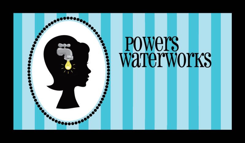 |
It still leaves me with an ambiguous sense of intent. Like it is kind of insulting. Thoughts dribbling out one reluctant drop at a time.
Though now it is very clear that the output of the faucet is ideas. Also, now I'm confused. At some point I apparently decided that Tom is 3894's husband. |
Nope. There was even a wedding thread on here three years ago, heh.
|
Yeah, don't know how it happened. But Helen's huband is a Tom, right?
|
Ok, I love the image with the lightbulb droplet. I think it's brilliant. Pun intended. :)
|
The lightbulb definitely add the whole "Ideas on tap" context.
|
Quote:
|
Quote:
|
I like the drip/bulb idea - not a fan of the colors or the font, imho. Alot of dead space.
|
Whereas I love the colors and open space.
I like the design! |
Quote:
|
I'd extend the area if it wasn't the front side of a business card. ;)
But I'm glad to hear that the concept is coming across clearer in this version. It's hard to get something like that across! I really appreciate all of your feedback; it helped me arrive here. Kudos to Tom for brainstorming with me, and tossing out the light bulb idea. I want to live in his Clever-Cleverland. I understand about the open space - though I do like the fact that it's not crammed. I don't see it as "dead" so much as purposefully open. My personal information will be on the back, as is the recent standard for Creative (capital C, meaning "hire me for my creativity") calling cards. |
Have you considered merging the W's? Like the W in Powers with W in WaterWorks in a cross or + like pattern? ImHo. I think the deadspace would be lesser if the eyeline of the figure was even with the lettering. ImHo
|
Since I'm late to the game, the first picture/thought was "She's a drip". But, does anyone call a person a drip anymore?
I get the picture now. The look of it reminds me of a Victorian silhouette which is not an era I usually associate with you. But, I like the look of it. |
| All times are GMT -7. The time now is 10:48 PM. |
Powered by vBulletin® Version 3.6.4
Copyright ©2000 - 2026, Jelsoft Enterprises Ltd.

