Logo Font - Please Vote
Hi all,
On some previous advice, I changed up the font a bit on my business logo. Please vote for your favorite in the poll, if any. :) Original: 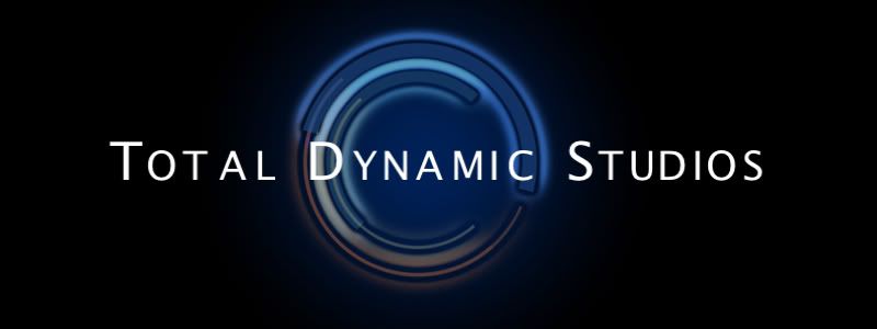 Option 1: 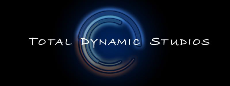 Option 2: 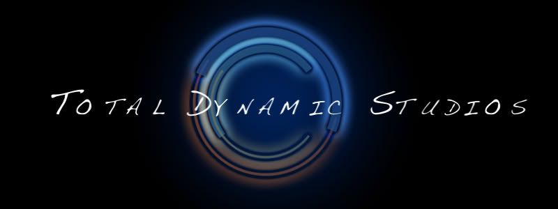 Option 3: 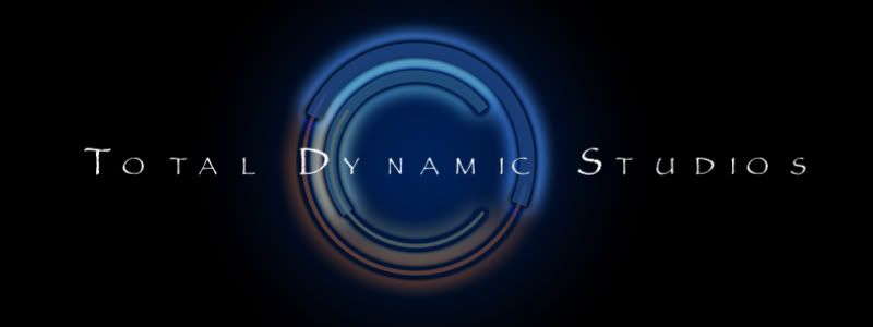 Option 4: 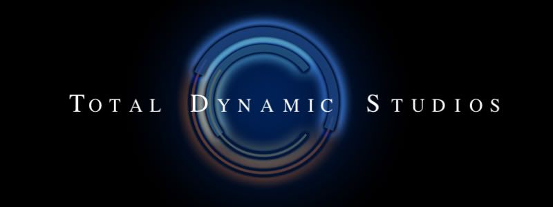 |
I like option 3. the font works with the image background better, rather than either standing out away from it or disappearing into it
|
I don't know why but the second one immediately makes me think of Heroes. Don't know if that is good/bad/or a sign of aneurysm.
I'm not a fan of serifs so I don't like the last one. I like the original and #3 best but the font is so narrow on #3 that the name is a big washed out by the logo behind. Also, I assume the odd kerning on "dy nam ic" in #3 is intentional but I think it just looks odd, more so because "nam" isn't centered. It still looks odd in the other two you used it in but not quite so much. |
What's the impression that you want to portray? All these fonts have unique personalities.
|
I still need to adjust the kerning on most of them. I didn't want to waste the time until I figure out which font people are going to like.
NM, I want it to portray "professional moving art". So, something professional and easy to read, but at the same time a bit "artsy". |
That's so weird, because I had almost the opposite reaction to the fonts from you, CJ...
I like 1 & 4 about equally, mostly because they have a smoother look, which to me goes better with the background graphic. I would like the first one better if it didn't seem quite so bold. I didn't like #3 because the writing suggests an older style... after all, the name of the font is Papyrus... whereas the graphic behind it suggests technology. In some ways that could be a good thing - it depends on how you vision your business, I think. I tended for #4 because it has the smooth appearance with a more comfortable touch. So, I haven't voted yet. I will after thinking about it a little more. |
I voted for option 2, but meant to vote for option 1.
|
option 3 looks the best to me... it screams professional artist to me...
|
Ah, you recognized the infamous Papyrus font. ;)
It is very dated, but I have a liking for it - not sure why. Figured I might as well throw it out there for feedback anyway. :) A little more background to my business - I always want to be known for taking the extra step towards perfection, and a very keen eye for detail. That might help with making a decision. |
I'll vote from home. Our firewall is blocking the pics.
|
I voted for the Original. I think it is more professional and less "artsy". Of the "new" fonts, I like Option 1 the best.
I don't like option 3 because of the font itself and also the spacing is weird on the letters. It looks like "To tal Dy namic St udios" to me. |
Ignore the spacing for now. ;) Kerning's a bitch on Motion, and I didn't want to spend the time adjusting each letter right now, until it's narrowed down. :)
|
Wait, when I said Option 1, I originally meant Original. *heh*
But I actually rather like Option 1 after looking at it. I'm waffling on all but options 2 & 3, which I don't care for, I think. (And I see what Cherny sees with the spacing issue). What the fonts say to me: Original - classic, clean, simple, technological, power. Option 1 - Modern, fun, comic books, playful, happy Option 4 - Classic, regal, a little old-school, smooth, professional. The more I look at 4, the less I care for it. I'm stuck between Original and #1 now. |
I'm glad you said kerning, T, that was going to be my first note. It's hard to judge a font if kerning is off.
The "dy" of dynamic overlays a pretty light and busy background - it's harder to read in two and three and four. One to a lesser extent. Also, I'd veer from making the TDS stand out so much. I know they're your initials, but it makes it less pleasing to the eye at a glance, particularly with the papyrus (and - unless it's Helvetica - if people can name the font, I wouldn't go with it.) It isn't such a contrast for font one, which is perhaps why I think it's the best of the lot. |
I went with option 3, kerning will be fixed. I'd like to see the text bolded a bit more, rather than just the initial caps of each word. Is this Papyrus (it looks similar) and could use a bit more oomph
|
Ah, I forgot to say - bottom line: make eyes happy and comfortable.
|
And - there are, I believe, some tricks in Motion that make kerning easier. I'll talk to Tom tonight (he's at an interview right now.)
|
I think all but 4 are an improvement over the original in that they have more artistic flair. Option 1 has a bit of a "sloppy writing" look which is cool, but perhaps a bit less professional. More fun. For some reason, 2 make me think of Dawson's Creek. I like 3 best. A touch of asian influence, but a bit harder to read so may need to play with that a bit.
|
Well, I always liked the original. It's bold, it's easy to read, it's professional.
However, if you really want something more artsy, I liked Options 1 and 3. I was going to guess that 3 was Ringbearer, but obviously I was wrong about that, heh. I wouldn't recognize Papyrus if it walked up to me and introduced itself while wearing a sticker that said, "Hi my name is Papyrus". |
Ok, I fixed the kerning on Option 1. Refresh your screens. ;)
|
Option #4, with the word "Dynamic" in the font from Option #1.
|
I like the original or 4 - I voted for 4. Those two looked the most professional to me.
|
Yay for kerning!
Though now the D in #1 is being severed by the multi-tonal background like the others (I think that's what my eye doesn't like) - but the shape of the D works much better than the other severed ones - so this is still my favorite. And also - I meant to say this before - yay for progress! |
I also voted for #4 because it looks more professional.
|
Quote:
|
Quote:
I'm seeing the same thing LSPE is seeing with the "D" in option 1. Actually, I notice it in most of them since the "D" is right on top of the logo like that, it really stands out more than the even the "T" and "S". |
Option # 2 looks like the font from "Friends" (the TV show).
My initial reaction on Options 2 & 3 is that if you are going to print (business cards), if you you reduce the logo, the fine lines of these type faces (especially in a reverse) will close up. |
Quote:
|
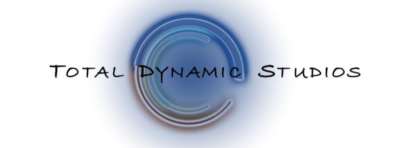
Here is Option 1 in "reverse print mode":
 |
Quote:
|
Of all of them, I like option 1 in the "reverse print mode" the best.
|
Quote:
|
Quote:
As a printer, I deal with this issue frequently. I actually had somebody send me a file with 8 point reverse type on an uncoated sheet. :eek: That and fine-line 6-point type in four-color process. |
I liked three.
|
I like 4.
I don't like the DY and the IC in 3. Looks funny. The Y is too long in 2. 2 and 3 are too thin. People with bad eyes might not be able to read it. :) |
I voted for 4 as I also couldn't look at 2 & 3 without "Friends" coming to mind, and I doubt that you're looking for that association.
|
For some reason, I thought of Lord of the Rings- or maybe New Line Cinema- when I looked at three. I think it's a nice balance of creative and assertive.
|
I put in a vote for 3, but I like 4 as well. Lashbear is a solid #3 guy.
|
As artsy as all the new fonts are, I think they make the word "Dynamic" look anything but.
Oddly, it's the bold and old-school serif of Option 4 that, to me, makes "Dynamic" look strong and also, imo, works better against the background image. It may be one of the "plain" options, but the phrase Total Dynamic Studios with that particular image just looks more active, powerful and attention-grabbing with that fuddy-duddy font. |
Okie-dokie. Based on this feedback, I have now transferred 400 fonts over from my other computer so that I can select a few more options based on the favorites selected here. So, there will be a new poll following soon. :)
|
| All times are GMT -7. The time now is 03:47 AM. |
Powered by vBulletin® Version 3.6.4
Copyright ©2000 - 2026, Jelsoft Enterprises Ltd.