Logo Font - Please Vote
Hi all,
On some previous advice, I changed up the font a bit on my business logo. Please vote for your favorite in the poll, if any. :) Original: 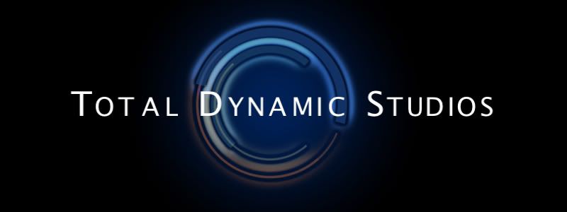 Option 1: 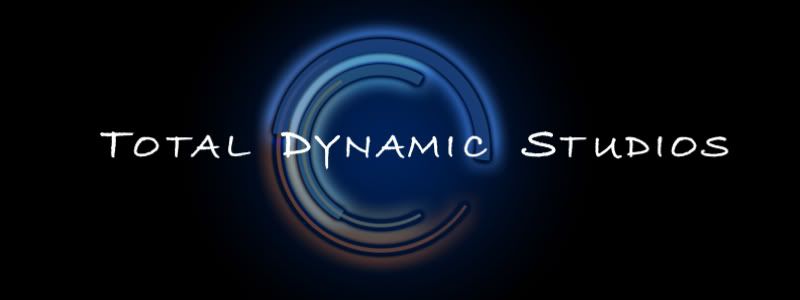 Option 2: 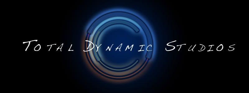 Option 3: 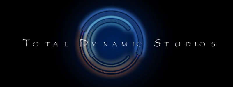 Option 4: 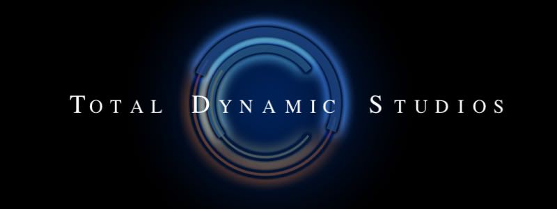 |
I like option 3. the font works with the image background better, rather than either standing out away from it or disappearing into it
|
I don't know why but the second one immediately makes me think of Heroes. Don't know if that is good/bad/or a sign of aneurysm.
I'm not a fan of serifs so I don't like the last one. I like the original and #3 best but the font is so narrow on #3 that the name is a big washed out by the logo behind. Also, I assume the odd kerning on "dy nam ic" in #3 is intentional but I think it just looks odd, more so because "nam" isn't centered. It still looks odd in the other two you used it in but not quite so much. |
What's the impression that you want to portray? All these fonts have unique personalities.
|
I still need to adjust the kerning on most of them. I didn't want to waste the time until I figure out which font people are going to like.
NM, I want it to portray "professional moving art". So, something professional and easy to read, but at the same time a bit "artsy". |
That's so weird, because I had almost the opposite reaction to the fonts from you, CJ...
I like 1 & 4 about equally, mostly because they have a smoother look, which to me goes better with the background graphic. I would like the first one better if it didn't seem quite so bold. I didn't like #3 because the writing suggests an older style... after all, the name of the font is Papyrus... whereas the graphic behind it suggests technology. In some ways that could be a good thing - it depends on how you vision your business, I think. I tended for #4 because it has the smooth appearance with a more comfortable touch. So, I haven't voted yet. I will after thinking about it a little more. |
I voted for option 2, but meant to vote for option 1.
|
option 3 looks the best to me... it screams professional artist to me...
|
Ah, you recognized the infamous Papyrus font. ;)
It is very dated, but I have a liking for it - not sure why. Figured I might as well throw it out there for feedback anyway. :) A little more background to my business - I always want to be known for taking the extra step towards perfection, and a very keen eye for detail. That might help with making a decision. |
I'll vote from home. Our firewall is blocking the pics.
|
| All times are GMT -7. The time now is 04:23 PM. |
Powered by vBulletin® Version 3.6.4
Copyright ©2000 - 2026, Jelsoft Enterprises Ltd.