Quote:
|
Originally Posted by sleepyjeff
Any chance we could see that graph with Margins of Error included?
|
Sure - the margin of errors aren't a secret, and the NOAA data charts and NASA data charts always have them:

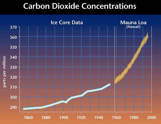
This is a UN chart, but the grey areas represent margin of error. Note the smaller (although stil existent) margin of error in the later data, which is direct measurement from Mauna Kea of Carbon Dioxide. In this graph, the yellow represents the margin of error:
I think you're implying uncertainty here, and there's always a level of uncertainty. But you can show CO2 levels with a simple calculation. If you begin with the year 1750, generally accepted as the beginning of the Industrial Revolution, when the standard measure for CO2 levels was 278ppmv, add the known level of human-generated CO2 for that year, then subtract 2.84% of the excess CO2 because that's how fast nature tries to restore the balance. If we do this for 255 years, up to 2005, we get the pink line in the graph below. It fits the black line the actual CO2 level like a glove.

How accurate is this fit? Considering the difficulties of gathering data from centuries past, amazingly close. We know, for example, that up until 1950, deforestation was putting about as much CO2 into the atmosphere as were burning fossils, but it's not easy to know how many trees were chopped down in, say, 1850, and how much CO2 this put into the air. In spite of imperfect data, the fact that a simple calculation predicts the extraordinary shape of actual CO2 so well is clear evidence this can not be a coincidental convergence. Human CO2 emissions must have caused the upsurge is atmospheric CO2.
So what? The link between human activity and rising CO2 levels is the first step. The next one is between CO2 and global warming. That was predicted over 100 years ago, but the evidence has become convincing only very recently.
CO2 Level information, by the way, comes from two sources. From 1958 forward, they are from a weather station high atop the Mona Loa volcano in Hawaii. They are so accurate, they show levels going up every autumn, when the leaves fall, and coming down every spring. Earlier data are from ice cores in Antarctica. The two sources agree remarkably well.