uromeinke, FEJ. and Ghoulish Delight RULE!!! NA abides.
 |
uromeinke, FEJ. and Ghoulish Delight RULE!!! NA abides. |
|
|
#1 |
|
Not Taking Any Crap!
|
Happy Weekend everyone!
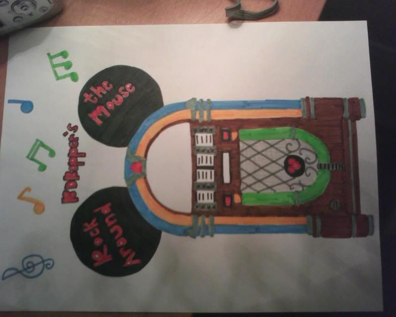
 A good friend of mine is working on a logo for my radio show (which I will be bringing back to the Internet Airwaves this month). I'd like some critiquing if you would be so kind. this is just a very rough draft and I'd like to what you think?  What is the goal other than looking neato, cool, and swanky? I want to put this logo on shirts, coffee mugs, and other similar paraphernalia. Oh and I know the picture is on its side...that's the way it was sent to me. Please let me know what you think. Thank you very much! Last edited by BDBopper : 03-01-2008 at 08:38 AM. |
|
|
Submit to Quotes

|
|
|
#2 |
|
Doing The Job
Join Date: Aug 2006
Location: In a state
Posts: 3,956
           |
Clever and good looking.
Certainly good enough for radio. (I know. It's internet radio, but I had to make that joke.) I do wonder if you might have trademark issues with the ears, use of the term "the mouse," etc.
__________________
Live now-pay later. Diner's Club! |
|
|
Submit to Quotes

|
|
|
#3 |
|
.
Join Date: Feb 2005
Posts: 13,354
           |
Definitely a trademark issue with the ears. As to whether Disney would ever get around to doing anything about it (or even learn of it) I don't know.
|
|
|
Submit to Quotes

|
|
|
#4 |
|
Not Taking Any Crap!
|
You bring up a good point. This is why this is a rough draft. I think the biggest issue would be the text. I've seen the "Ears" used in many different uses that were not Disney's. On the Simpsons and Family Guy for instance. Wouldn't they have had to pay a lot of money for that use?
|
|
|
Submit to Quotes

|
|
|
#5 |
|
ohhhh baby
|
"The Ears" are often done in ways that aren't exactly Mickey's, to avoid problems. They purposely use an incorrect shape, size, proportion, orientation, color, etc.
Mousepod got away with his logo, so I'm not sure where the line is drawn. My real critique would be that you need a better font - more legible and more official (in other words, don't hand draw it).
__________________
The second star to the right shines in the night for you |
|
|
Submit to Quotes

|