uromeinke, FEJ. and Ghoulish Delight RULE!!! NA abides.
uromeinke, FEJ. and Ghoulish Delight RULE!!! NA abides. |
 10-13-2011, 04:40 PM
|
#171 |
|
Chowder Head

Join Date: Jan 2005
Location: Yes
Posts: 18,500
  |
I have a Bachelor's degree in printing ("Graphic Communication") and one of the classes I took was called "Design with Type." I learned all sorts of fascinating minutia about fonts. One of our assignments was creating a one sheet with a poem or some other text along with an image behind it. Besides the layout challenge, we had to use a system where the kerning was turned off and we had to manually code ALL of the kerning.
So far, I haven't had the patience to take the test GD linked to to see if I retained any of those skills. Another mostly useless factoid I learnt was that in Postscript (and most proper vector-based typesetting protocols), the details of each character vary ever so slightly depending on the point size; this was demonstrated by outputting the same character (same font obviously) in a 6 point and a 72 point size, then blowing up the 6 point character to the same visual size as the 72 point character to display them side-by-side. When comparing, you would see where the stroke might vary, the transition of a crossbar was more filled in on one, etc. Another assignment was programming in raw Postscript coding. While searching for a visual illustration of the font size difference, I ran across the image below. I remember creating an image exactly like the one on the left side of this image. EXACTLY! 
__________________
The thing about quotes on the internet is that you cannot verify their validity.
- Abraham Lincoln |

|
Submit to Quotes

|
|
10-14-2011, 06:30 PM
|
#172 |
|
.
Join Date: Feb 2005
Posts: 13,354
|
89. If that's all that kerning involves and it can be done that well with about 8 seconds of effort on each one (I assume that's not actually the case) then typesetters need to stop proclaiming they've accomplished anything all that noteworthy.
|
|
|
Submit to Quotes
|
|
10-14-2011, 08:19 PM
|
#173 |
|
ohhhh baby

Join Date: Jan 2005
Location: Parental Bliss
Posts: 12,364
  |
93. I completely blew one of them.
__________________
The second star to the right shines in the night for you |
|
|
Submit to Quotes
|
|
10-19-2011, 10:08 AM
|
#174 |
|
BRAAAAAAAINS!

Join Date: Jan 2005
Location: One Step Beyond...
Posts: 8,802
 |
|
|
|
Submit to Quotes
|
|
10-19-2011, 01:25 PM
|
#175 |
|
...

Join Date: Jan 2005
Posts: 13,244
|
80%
|
|
|
Submit to Quotes
|
|
10-19-2011, 01:28 PM
|
#176 |
|
.
Join Date: Feb 2005
Posts: 13,354
|
The Type Fight sight isn't loading correctly for me so I'm not sure I am correct about what it is doing, but how does one decide which font is better without the context of a specific use?
Most fonts are good fonts for something (except comic sans). |
|
|
Submit to Quotes
|
|
10-28-2011, 11:51 AM
|
#177 |
|
I Floop the Pig

Join Date: Jan 2005
Location: Alternative Swankstyle
Posts: 19,348
|
Shape Type, way harder than the Kerning Game. I only got 71%.
__________________
'He who receives an idea from me, receives instruction himself without lessening mine; as he who lights his taper at mine, receives light without darkening me.' -TJ 
|
|
|
Submit to Quotes
|
|
10-29-2011, 06:32 AM
|
#178 |
|
Kicking up my heels!

Join Date: Jan 2005
Location: The Silver State
Posts: 3,783
|
I got 71% too!
__________________
Nee Stell Thue |
|
|
Submit to Quotes
|
|
11-01-2011, 06:45 PM
|
#179 |
|
Chowder Head
Join Date: Jan 2005
Location: Yes
Posts: 18,500
|
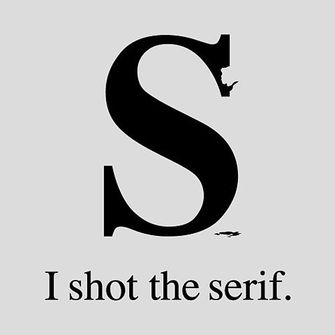
__________________
The thing about quotes on the internet is that you cannot verify their validity.
- Abraham Lincoln |
|
|
Submit to Quotes
|
|
12-07-2011, 10:31 AM
|
#180 |
|
Chowder Head
Join Date: Jan 2005
Location: Yes
Posts: 18,500
|
__________________
The thing about quotes on the internet is that you cannot verify their validity.
- Abraham Lincoln |
|
|
Submit to Quotes
|


 Linear Mode

