Logo Fonts - Part Deux
Ok, this is the last poll. (I hope.)
Based upon your feedback in the previous thread, I played with a few more fonts that reflect the more popular styles. So, please vote again and offer feedback. :) Thanks for helping! Option 1:  Option 2:  Option 3:  Option 4:  Option 5:  Option 6: 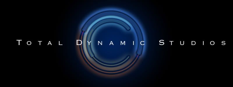 Option 7: 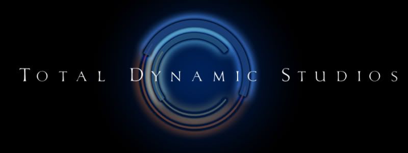 Option 8:  |
I like Option 5 but Option 7 looks more pro. My issue is the back image being almost out of focus because of the flare/ glow. To me, sharpening up the blacks in the (c) would help quite a bit. I feel like squinting.
|
I like boobies.
Oh yeah, I'm torn between 1 & 8. |
Quote:
|
I like #'s 3 and 7.
|
Number 1 is a clear winner to me.
|
I liked 1 and 3, but when I just scrolled through them, #3 jumped out at me, so I went with 3
|
I went with #1 - I think a nice, clean, sans serif logo works for you...
|
I like #3.
It reminds me of a letterboxed picture. I like the way the black frames the name and logo. On most of these, I think there should be equal amounts of black on both sides of the company name. Meaning the amount of black before the T and after the S should be the same. #8 reminds me of the font for the film Total Recall. :) |
#1 looks the best to me, but #5 I still like.
|
I like 1, 3, and 6 - though I still don't have an ideas about resolving the DY issue we talked about last round, sorry!
|
Quote:
Quote:
Once the font is finalized though, I might pick a different rotation of the circle, so that might help with the DY fading issue. |
This is exciting, isn't it? Designing your logo? Fun!
:) |
Quote:
|
Quote:
:) I have my logo all figured out in my head. For what? I don't know. But I have a logo. :D |
I can't believe that only three people like boobies. What's with you people?!?
But I see NM has not voted yet. That one is a given. (Hint: you can vote for more than one!) |
#1, with #2 coming in second place. Neither of those fonts seem distinct and don't immediately remind me of other logos I've seen. Very cool!
|
1, 2, 6 and boobies.
In order of how I like them: Boobies #1 #2 #6 Where is the Taco option? I'm craving tacos right now... |
Quote:
|
Quote:
What would you have done if more votes came in for boobies than any other option? Would boobies have been your logo? I am also happy to know that my wife likes boobies :D |
Quote:
Quote:
|
3, 5, and 7 are what I enjoy for various reasons...
3 and 7 reminds me of Tourchwood... (Darn Serif Fonts!!) and 5 is artsy... and who could forget that last option ;) |
Boobies is up to 7 now. :)
|
Quote:
|
I like 1 and 6.
My own boobies annoy me, but other people have nice ones! |
Quote:
|
I like 1,3, boobies, 4,7. I don't think 5 looks professional, even on a creative level.
|
more people like option 1, and didn't click boobies... shame!
|
| All times are GMT -7. The time now is 03:29 AM. |
Powered by vBulletin® Version 3.6.4
Copyright ©2000 - 2026, Jelsoft Enterprises Ltd.