uromeinke, FEJ. and Ghoulish Delight RULE!!! NA abides.
uromeinke, FEJ. and Ghoulish Delight RULE!!! NA abides. |
|
 |
|||||||
| View Poll Results: Please select your favorites from the provided samples. | |||
| Option 1 |
|
12 | 52.17% |
| Option 2 |
|
1 | 4.35% |
| Option 3 |
|
5 | 21.74% |
| Option 4 |
|
4 | 17.39% |
| Option 5 |
|
5 | 21.74% |
| Option 6 |
|
3 | 13.04% |
| Option 7 |
|
6 | 26.09% |
| Option 8 |
|
3 | 13.04% |
| None of the above. |
|
0 | 0% |
| Stop with the polls already! |
|
0 | 0% |
| I like boobies. |
|
8 | 34.78% |
| Multiple Choice Poll. Voters: 23. You may not vote on this poll | |||
 |
|
|
Thread Tools | Search this Thread | Display Modes |
 11-12-2007, 11:48 PM
|
#1 |
|
SQUIRREL!

Join Date: Jan 2005
Location: On the curbside.
Posts: 5,098
  |
Logo Fonts - Part Deux
Ok, this is the last poll. (I hope.)
Based upon your feedback in the previous thread, I played with a few more fonts that reflect the more popular styles. So, please vote again and offer feedback.  Thanks for helping! Option 1:  Option 2:  Option 3:  Option 4:  Option 5:  Option 6: 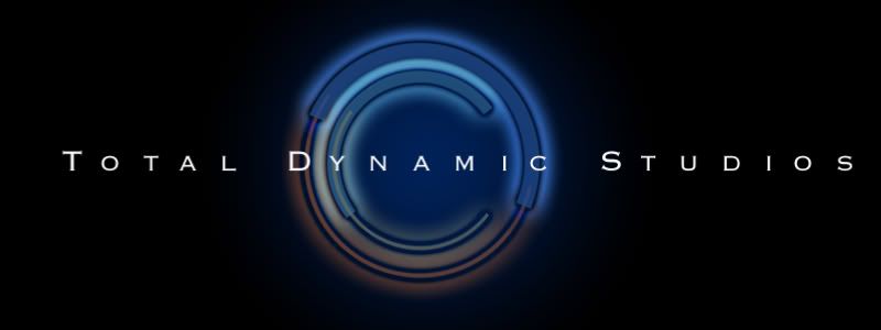 Option 7: 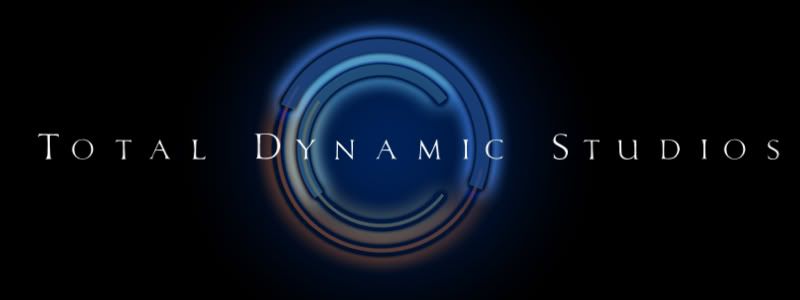 Option 8:  |

|
Submit to Quotes

|
|
11-13-2007, 12:03 AM
|
#2 |
|
Lego

Join Date: Jan 2005
Location: Disneyland, USA
Posts: 3,704
 |
I like Option 5 but Option 7 looks more pro. My issue is the back image being almost out of focus because of the flare/ glow. To me, sharpening up the blacks in the (c) would help quite a bit. I feel like squinting.
|
|
|
Submit to Quotes
|
|
11-13-2007, 12:07 AM
|
#3 |
|
BRAAAAAAAINS!

Join Date: Jan 2005
Location: One Step Beyond...
Posts: 8,802
  |
I like boobies.
Oh yeah, I'm torn between 1 & 8. |
|
|
Submit to Quotes
|
|
11-13-2007, 12:33 AM
|
#4 | |
|
SQUIRREL!
Join Date: Jan 2005
Location: On the curbside.
Posts: 5,098
|
Quote:
|
|
|
|
Submit to Quotes
|
|
11-13-2007, 12:41 AM
|
#5 |
|
Nevermind

Join Date: Jan 2005
Posts: 7,847
|
I like #'s 3 and 7.
|
|
|
Submit to Quotes
|
|
11-13-2007, 01:10 AM
|
#6 |
|
I throw stones at houses

Join Date: Jan 2005
Location: Location: Location
Posts: 9,534
|
Number 1 is a clear winner to me.
__________________
http://bash.org/?top "It is useless for sheep to pass a resolution in favor of vegetarianism while wolves remain of a different opinion." -- William Randolph Inge |
|
|
Submit to Quotes
|
|
11-13-2007, 07:51 AM
|
#7 |
|
lost in the fog

Join Date: Jul 2005
Location: San Francisco
Posts: 7,831
|
I liked 1 and 3, but when I just scrolled through them, #3 jumped out at me, so I went with 3
__________________
Be yourself; everyone else is already taken. - Oscar Wilde |
|
|
Submit to Quotes
|
|
11-13-2007, 08:11 AM
|
#8 |
|
You broke your Ramadar!

Join Date: Jan 2005
Posts: 4,635
|
I went with #1 - I think a nice, clean, sans serif logo works for you...
__________________
"Give the public everything you can give them, keep the place as clean as you can keep it, keep it friendly" - Walt Disney |
|
|
Submit to Quotes
|
|
11-13-2007, 08:57 AM
|
#9 |
|
...

Join Date: Jan 2005
Posts: 13,244
|
I like #3.
It reminds me of a letterboxed picture. I like the way the black frames the name and logo. On most of these, I think there should be equal amounts of black on both sides of the company name. Meaning the amount of black before the T and after the S should be the same. #8 reminds me of the font for the film Total Recall. |
|
|
Submit to Quotes
|
|
11-13-2007, 09:06 AM
|
#10 |
|
Eyes like Sapphires!

Join Date: Oct 2006
Location: 2.4 miles from Disneyland
Posts: 1,523
|
#1 looks the best to me, but #5 I still like.
__________________
Diane "Honesty may be the best policy, but it's important to remember that apparently, by elimination, dishonesty is the second-best policy." - George Carlin 1937-2008 DISNEY IS FINALLY PAYING ME BACK......STILL OWES ME ABOUT (oh, wait....way too much)! |
|
|
Submit to Quotes
|


 Linear Mode

