Logo Fonts - Part Deux
Ok, this is the last poll. (I hope.)
Based upon your feedback in the previous thread, I played with a few more fonts that reflect the more popular styles. So, please vote again and offer feedback. :) Thanks for helping! Option 1:  Option 2:  Option 3:  Option 4:  Option 5:  Option 6: 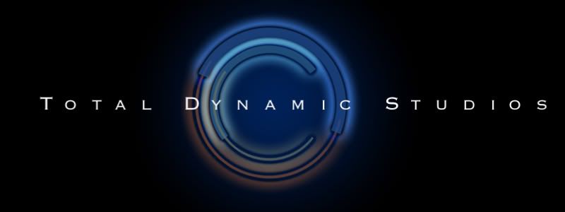 Option 7: 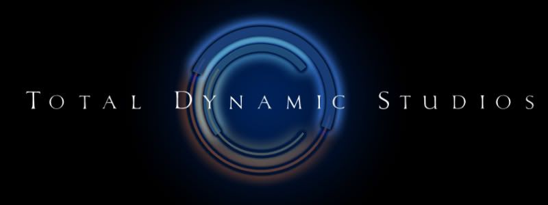 Option 8:  |
I like Option 5 but Option 7 looks more pro. My issue is the back image being almost out of focus because of the flare/ glow. To me, sharpening up the blacks in the (c) would help quite a bit. I feel like squinting.
|
I like boobies.
Oh yeah, I'm torn between 1 & 8. |
Quote:
|
I like #'s 3 and 7.
|
Number 1 is a clear winner to me.
|
I liked 1 and 3, but when I just scrolled through them, #3 jumped out at me, so I went with 3
|
I went with #1 - I think a nice, clean, sans serif logo works for you...
|
I like #3.
It reminds me of a letterboxed picture. I like the way the black frames the name and logo. On most of these, I think there should be equal amounts of black on both sides of the company name. Meaning the amount of black before the T and after the S should be the same. #8 reminds me of the font for the film Total Recall. :) |
#1 looks the best to me, but #5 I still like.
|
| All times are GMT -7. The time now is 01:01 PM. |
Powered by vBulletin® Version 3.6.4
Copyright ©2000 - 2026, Jelsoft Enterprises Ltd.