uromeinke, FEJ. and Ghoulish Delight RULE!!! NA abides.
uromeinke, FEJ. and Ghoulish Delight RULE!!! NA abides. |
|
 |
|||||||
| View Poll Results: What Logo Font Do You Like Best? | |||
| Original |
|
6 | 16.67% |
| Option 1 |
|
5 | 13.89% |
| Option 2 |
|
4 | 11.11% |
| Option 3 |
|
12 | 33.33% |
| Option 4 |
|
9 | 25.00% |
| None of these. Back to the drawing board with you! |
|
0 | 0% |
| Voters: 36. You may not vote on this poll | |||
 |
|
|
Thread Tools | Search this Thread | Display Modes |
 11-08-2007, 02:03 PM
|
#1 |
|
SQUIRREL!

Join Date: Jan 2005
Location: On the curbside.
Posts: 5,098
  |
Logo Font - Please Vote
Hi all,
On some previous advice, I changed up the font a bit on my business logo. Please vote for your favorite in the poll, if any.  Original: 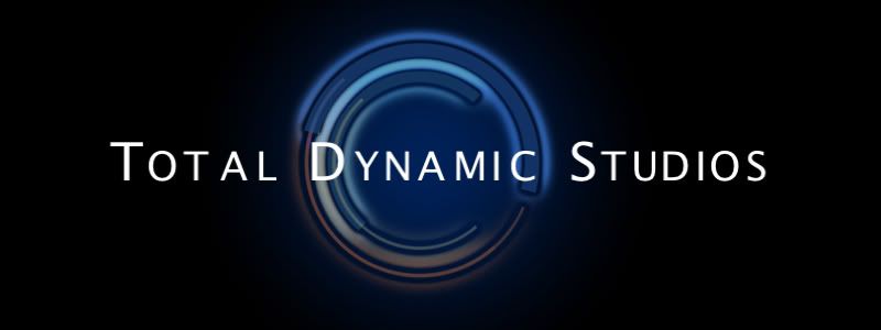 Option 1: 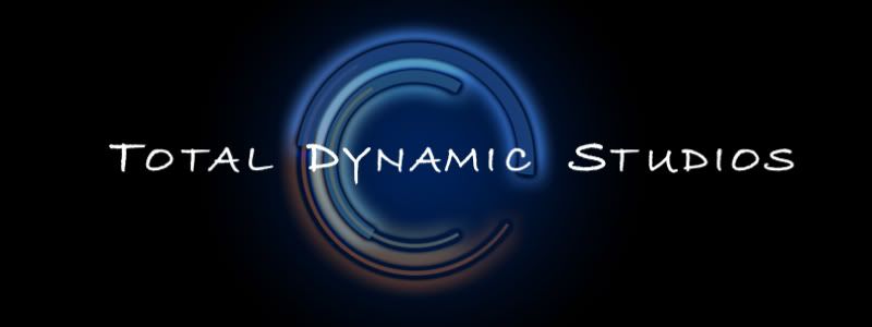 Option 2: 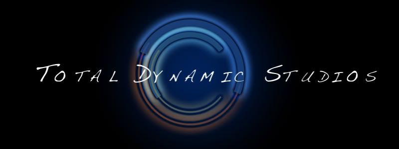 Option 3: 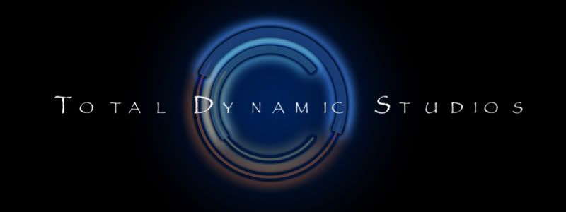 Option 4: 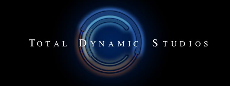 Last edited by Disneyphile : 11-08-2007 at 02:41 PM. |

|
Submit to Quotes

|
|
11-08-2007, 02:06 PM
|
#2 |
|
check your head

Join Date: Oct 2005
Posts: 4,174
|
I like option 3. the font works with the image background better, rather than either standing out away from it or disappearing into it
__________________
 a clear conscience is a sure sign of a fuzzy memory |
|
|
Submit to Quotes
|
|
11-08-2007, 02:08 PM
|
#3 |
|
.
Join Date: Feb 2005
Posts: 13,354
|
I don't know why but the second one immediately makes me think of Heroes. Don't know if that is good/bad/or a sign of aneurysm.
I'm not a fan of serifs so I don't like the last one. I like the original and #3 best but the font is so narrow on #3 that the name is a big washed out by the logo behind. Also, I assume the odd kerning on "dy nam ic" in #3 is intentional but I think it just looks odd, more so because "nam" isn't centered. It still looks odd in the other two you used it in but not quite so much. |
|
|
Submit to Quotes
|
|
11-08-2007, 02:09 PM
|
#4 |
|
Making Change Happen

Join Date: Jan 2005
Posts: 990
|
What's the impression that you want to portray? All these fonts have unique personalities.
|
|
|
Submit to Quotes
|
|
11-08-2007, 02:12 PM
|
#5 |
|
SQUIRREL!
Join Date: Jan 2005
Location: On the curbside.
Posts: 5,098
|
I still need to adjust the kerning on most of them. I didn't want to waste the time until I figure out which font people are going to like.
NM, I want it to portray "professional moving art". So, something professional and easy to read, but at the same time a bit "artsy". |
|
|
Submit to Quotes
|
|
11-08-2007, 02:14 PM
|
#6 |
|
Nueve

Join Date: Jan 2005
Posts: 6,497
  |
That's so weird, because I had almost the opposite reaction to the fonts from you, CJ...
I like 1 & 4 about equally, mostly because they have a smoother look, which to me goes better with the background graphic. I would like the first one better if it didn't seem quite so bold. I didn't like #3 because the writing suggests an older style... after all, the name of the font is Papyrus... whereas the graphic behind it suggests technology. In some ways that could be a good thing - it depends on how you vision your business, I think. I tended for #4 because it has the smooth appearance with a more comfortable touch. So, I haven't voted yet. I will after thinking about it a little more.
__________________
Tomorrow is the day for you and me |
|
|
Submit to Quotes
|
|
11-08-2007, 02:16 PM
|
#7 |
|
I Floop the Pig

Join Date: Jan 2005
Location: Alternative Swankstyle
Posts: 19,348
|
I voted for option 2, but meant to vote for option 1.
__________________
'He who receives an idea from me, receives instruction himself without lessening mine; as he who lights his taper at mine, receives light without darkening me.' -TJ 
|
|
|
Submit to Quotes
|
|
11-08-2007, 02:18 PM
|
#8 |
|
Join the Darkside
Join Date: Jun 2007
Location: Within 78 miles of WDW...
Posts: 307
 |
option 3 looks the best to me... it screams professional artist to me...
|
|
|
Submit to Quotes
|
|
11-08-2007, 02:18 PM
|
#9 |
|
SQUIRREL!
Join Date: Jan 2005
Location: On the curbside.
Posts: 5,098
|
Ah, you recognized the infamous Papyrus font.
 It is very dated, but I have a liking for it - not sure why. Figured I might as well throw it out there for feedback anyway. A little more background to my business - I always want to be known for taking the extra step towards perfection, and a very keen eye for detail. That might help with making a decision. |
|
|
Submit to Quotes
|
|
11-08-2007, 02:20 PM
|
#10 |
|
...

Join Date: Jan 2005
Posts: 13,244
|
I'll vote from home. Our firewall is blocking the pics.
|
|
|
Submit to Quotes
|
|
| Thread Tools | Search this Thread |
| Display Modes | |
|
|


 Linear Mode

