uromeinke, FEJ. and Ghoulish Delight RULE!!! NA abides.
uromeinke, FEJ. and Ghoulish Delight RULE!!! NA abides. |
|
 |
|||||||
| View Poll Results: What Logo Font Do You Like Best? | |||
| Original |
|
6 | 16.67% |
| Option 1 |
|
5 | 13.89% |
| Option 2 |
|
4 | 11.11% |
| Option 3 |
|
12 | 33.33% |
| Option 4 |
|
9 | 25.00% |
| None of these. Back to the drawing board with you! |
|
0 | 0% |
| Voters: 36. You may not vote on this poll | |||
 |
|
|
Thread Tools | Search this Thread | Display Modes |
 11-08-2007, 02:48 PM
|
#21 |
|
8/30/14 - Disneyland -10k or Bust.

Join Date: Jan 2005
Posts: 9,022
     |
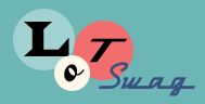
Option #4, with the word "Dynamic" in the font from Option #1.
__________________
- Taking it one step at a time.
Last edited by Moonliner : 11-08-2007 at 02:59 PM. |

|
Submit to Quotes

|
|
11-08-2007, 02:54 PM
|
#22 |
|
Senior Member

Join Date: Apr 2005
Location: San Diego
Posts: 4,678
|
I like the original or 4 - I voted for 4. Those two looked the most professional to me.
__________________
My life is so exciting I can hardly stand it. |
|
|
Submit to Quotes
|
|
11-08-2007, 02:59 PM
|
#23 |
|
scribblin'

Join Date: Jan 2005
Location: in the moment
Posts: 3,872
|
Yay for kerning!
Though now the D in #1 is being severed by the multi-tonal background like the others (I think that's what my eye doesn't like) - but the shape of the D works much better than the other severed ones - so this is still my favorite. And also - I meant to say this before - yay for progress! |
|
|
Submit to Quotes
|
|
11-08-2007, 03:03 PM
|
#24 |
|
Worn Romantic

Join Date: Feb 2006
Location: Long Beach California
Posts: 8,435
|
I also voted for #4 because it looks more professional.
__________________
Unrestrained frivolity will lead to the downfall of modern society. |
|
|
Submit to Quotes
|
|
11-08-2007, 03:03 PM
|
#25 | |
|
8/30/14 - Disneyland -10k or Bust.
Join Date: Jan 2005
Posts: 9,022
|
Quote:
__________________
- Taking it one step at a time.
|
|
|
|
Submit to Quotes
|
|
11-08-2007, 03:13 PM
|
#26 | |
|
I Floop the Pig

Join Date: Jan 2005
Location: Alternative Swankstyle
Posts: 19,348
|
Quote:
I'm seeing the same thing LSPE is seeing with the "D" in option 1. Actually, I notice it in most of them since the "D" is right on top of the logo like that, it really stands out more than the even the "T" and "S".
__________________
'He who receives an idea from me, receives instruction himself without lessening mine; as he who lights his taper at mine, receives light without darkening me.' -TJ 
|
|
|
|
Submit to Quotes
|
|
11-08-2007, 03:24 PM
|
#27 |
|
Chowder Head

Join Date: Jan 2005
Location: Yes
Posts: 18,500
|
Option # 2 looks like the font from "Friends" (the TV show).
My initial reaction on Options 2 & 3 is that if you are going to print (business cards), if you you reduce the logo, the fine lines of these type faces (especially in a reverse) will close up.
__________________
The thing about quotes on the internet is that you cannot verify their validity.
- Abraham Lincoln |
|
|
Submit to Quotes
|
|
11-08-2007, 03:35 PM
|
#28 | |
|
scribblin'
Join Date: Jan 2005
Location: in the moment
Posts: 3,872
|
Quote:
|
|
|
|
Submit to Quotes
|
|
11-08-2007, 03:45 PM
|
#29 |
|
SQUIRREL!

Join Date: Jan 2005
Location: On the curbside.
Posts: 5,098
|
Here is Option 1 in "reverse print mode":
 |
|
|
Submit to Quotes
|
|
11-08-2007, 04:40 PM
|
#30 | |
|
Chowder Head
Join Date: Jan 2005
Location: Yes
Posts: 18,500
|
Quote:
__________________
The thing about quotes on the internet is that you cannot verify their validity.
- Abraham Lincoln |
|
|
|
Submit to Quotes
|
|
| Thread Tools | Search this Thread |
| Display Modes | |
|
|


 Linear Mode

