uromeinke, FEJ. and Ghoulish Delight RULE!!! NA abides.
uromeinke, FEJ. and Ghoulish Delight RULE!!! NA abides. |
|
 |
|||||||
| View Poll Results: Please select your favorites from the provided samples. | |||
| Option 1 |
|
12 | 52.17% |
| Option 2 |
|
1 | 4.35% |
| Option 3 |
|
5 | 21.74% |
| Option 4 |
|
4 | 17.39% |
| Option 5 |
|
5 | 21.74% |
| Option 6 |
|
3 | 13.04% |
| Option 7 |
|
6 | 26.09% |
| Option 8 |
|
3 | 13.04% |
| None of the above. |
|
0 | 0% |
| Stop with the polls already! |
|
0 | 0% |
| I like boobies. |
|
8 | 34.78% |
| Multiple Choice Poll. Voters: 23. You may not vote on this poll | |||
 |
|
|
Thread Tools | Search this Thread | Display Modes |
 11-13-2007, 09:27 AM
|
#11 |
|
scribblin'

Join Date: Jan 2005
Location: in the moment
Posts: 3,872
  |
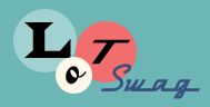
I like 1, 3, and 6 - though I still don't have an ideas about resolving the DY issue we talked about last round, sorry!
|

|
Submit to Quotes

|
|
11-13-2007, 10:26 AM
|
#12 | ||
|
SQUIRREL!

Join Date: Jan 2005
Location: On the curbside.
Posts: 5,098
|
Quote:
 Quote:
Once the font is finalized though, I might pick a different rotation of the circle, so that might help with the DY fading issue. |
||
|
|
Submit to Quotes
|
|
11-13-2007, 10:43 AM
|
#13 |
|
...

Join Date: Jan 2005
Posts: 13,244
|
This is exciting, isn't it? Designing your logo? Fun!
|
|
|
Submit to Quotes
|
|
11-13-2007, 11:09 AM
|
#14 | |
|
SQUIRREL!
Join Date: Jan 2005
Location: On the curbside.
Posts: 5,098
|
Quote:
 It's now at the point that it's kinda annoying as well, because I just want it done so I can finish up my website and order business cards and actually have an income. It's now at the point that it's kinda annoying as well, because I just want it done so I can finish up my website and order business cards and actually have an income. |
|
|
|
Submit to Quotes
|
|
11-13-2007, 11:12 AM
|
#15 | |
|
...
Join Date: Jan 2005
Posts: 13,244
|
Quote:
I have my logo all figured out in my head. For what? I don't know. But I have a logo.  |
|
|
|
Submit to Quotes
|
|
11-13-2007, 01:18 PM
|
#16 |
|
Chowder Head

Join Date: Jan 2005
Location: Yes
Posts: 18,500
|
I can't believe that only three people like boobies. What's with you people?!?
But I see NM has not voted yet. That one is a given. (Hint: you can vote for more than one!)
__________________
The thing about quotes on the internet is that you cannot verify their validity.
- Abraham Lincoln |
|
|
Submit to Quotes
|
|
11-13-2007, 02:28 PM
|
#17 |
|
Sputnik Sweetheart

Join Date: Jan 2005
Location: Long Beach
Posts: 2,685
 |
#1, with #2 coming in second place. Neither of those fonts seem distinct and don't immediately remind me of other logos I've seen. Very cool!
|
|
|
Submit to Quotes
|
|
11-13-2007, 02:38 PM
|
#18 |
|
Nueve

Join Date: Jan 2005
Posts: 6,497
 |
1, 2, 6 and boobies.
In order of how I like them: Boobies #1 #2 #6 Where is the Taco option? I'm craving tacos right now...
__________________
Tomorrow is the day for you and me |
|
|
Submit to Quotes
|
|
11-13-2007, 03:26 PM
|
#19 | |
|
SQUIRREL!
Join Date: Jan 2005
Location: On the curbside.
Posts: 5,098
|
Quote:
 |
|
|
|
Submit to Quotes
|
|
11-13-2007, 03:41 PM
|
#20 | |
|
Chowder Head
Join Date: Jan 2005
Location: Yes
Posts: 18,500
|
Quote:
What would you have done if more votes came in for boobies than any other option? Would boobies have been your logo? I am also happy to know that my wife likes boobies
__________________
The thing about quotes on the internet is that you cannot verify their validity.
- Abraham Lincoln |
|
|
|
Submit to Quotes
|
|
| Thread Tools | Search this Thread |
| Display Modes | |
|
|


 Linear Mode

