uromeinke, FEJ. and Ghoulish Delight RULE!!! NA abides.
uromeinke, FEJ. and Ghoulish Delight RULE!!! NA abides. |
|
 |
|||||||
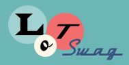
| View Poll Results: What Logo Font Do You Like Best? | |||
| Original |
|
6 | 16.67% |
| Option 1 |
|
5 | 13.89% |
| Option 2 |
|
4 | 11.11% |
| Option 3 |
|
12 | 33.33% |
| Option 4 |
|
9 | 25.00% |
| None of these. Back to the drawing board with you! |
|
0 | 0% |
| Voters: 36. You may not vote on this poll | |||
 |
|
|
Thread Tools | Search this Thread | Display Modes |
 11-08-2007, 02:22 PM
|
#11 |
|
Biophage

Join Date: Jan 2005
Location: The Moon
Posts: 2,679
  |
I voted for the Original. I think it is more professional and less "artsy". Of the "new" fonts, I like Option 1 the best.
I don't like option 3 because of the font itself and also the spacing is weird on the letters. It looks like "To tal Dy namic St udios" to me.
__________________
And they say back then our universe Was a coal black egg Until the god inside Burst out and from its shattered shell He made what became the world we know ~ Bjork (Cosmogony) |

|
Submit to Quotes

|
|
11-08-2007, 02:24 PM
|
#12 |
|
SQUIRREL!

Join Date: Jan 2005
Location: On the curbside.
Posts: 5,098
|
Ignore the spacing for now.
 Kerning's a bitch on Motion, and I didn't want to spend the time adjusting each letter right now, until it's narrowed down. Kerning's a bitch on Motion, and I didn't want to spend the time adjusting each letter right now, until it's narrowed down.  |
|
|
Submit to Quotes
|
|
11-08-2007, 02:29 PM
|
#13 |
|
Nueve

Join Date: Jan 2005
Posts: 6,497
  |
Wait, when I said Option 1, I originally meant Original. *heh*
But I actually rather like Option 1 after looking at it. I'm waffling on all but options 2 & 3, which I don't care for, I think. (And I see what Cherny sees with the spacing issue). What the fonts say to me: Original - classic, clean, simple, technological, power. Option 1 - Modern, fun, comic books, playful, happy Option 4 - Classic, regal, a little old-school, smooth, professional. The more I look at 4, the less I care for it. I'm stuck between Original and #1 now.
__________________
Tomorrow is the day for you and me |
|
|
Submit to Quotes
|
|
11-08-2007, 02:32 PM
|
#14 |
|
scribblin'

Join Date: Jan 2005
Location: in the moment
Posts: 3,872
|
I'm glad you said kerning, T, that was going to be my first note. It's hard to judge a font if kerning is off.
The "dy" of dynamic overlays a pretty light and busy background - it's harder to read in two and three and four. One to a lesser extent. Also, I'd veer from making the TDS stand out so much. I know they're your initials, but it makes it less pleasing to the eye at a glance, particularly with the papyrus (and - unless it's Helvetica - if people can name the font, I wouldn't go with it.) It isn't such a contrast for font one, which is perhaps why I think it's the best of the lot. |
|
|
Submit to Quotes
|
|
11-08-2007, 02:35 PM
|
#15 |
|
lost in the fog

Join Date: Jul 2005
Location: San Francisco
Posts: 7,831
|
I went with option 3, kerning will be fixed. I'd like to see the text bolded a bit more, rather than just the initial caps of each word. Is this Papyrus (it looks similar) and could use a bit more oomph
__________________
Be yourself; everyone else is already taken. - Oscar Wilde |
|
|
Submit to Quotes
|
|
11-08-2007, 02:35 PM
|
#16 |
|
scribblin'
Join Date: Jan 2005
Location: in the moment
Posts: 3,872
|
Ah, I forgot to say - bottom line: make eyes happy and comfortable.
|
|
|
Submit to Quotes
|
|
11-08-2007, 02:36 PM
|
#17 |
|
scribblin'
Join Date: Jan 2005
Location: in the moment
Posts: 3,872
|
And - there are, I believe, some tricks in Motion that make kerning easier. I'll talk to Tom tonight (he's at an interview right now.)
|
|
|
Submit to Quotes
|
|
11-08-2007, 02:37 PM
|
#18 |
|
Making Change Happen

Join Date: Jan 2005
Posts: 990
|
I think all but 4 are an improvement over the original in that they have more artistic flair. Option 1 has a bit of a "sloppy writing" look which is cool, but perhaps a bit less professional. More fun. For some reason, 2 make me think of Dawson's Creek. I like 3 best. A touch of asian influence, but a bit harder to read so may need to play with that a bit.
|
|
|
Submit to Quotes
|
|
11-08-2007, 02:40 PM
|
#19 |
|
I throw stones at houses

Join Date: Jan 2005
Location: Location: Location
Posts: 9,534
|
Well, I always liked the original. It's bold, it's easy to read, it's professional.
However, if you really want something more artsy, I liked Options 1 and 3. I was going to guess that 3 was Ringbearer, but obviously I was wrong about that, heh. I wouldn't recognize Papyrus if it walked up to me and introduced itself while wearing a sticker that said, "Hi my name is Papyrus".
__________________
http://bash.org/?top "It is useless for sheep to pass a resolution in favor of vegetarianism while wolves remain of a different opinion." -- William Randolph Inge |
|
|
Submit to Quotes
|
|
11-08-2007, 02:42 PM
|
#20 |
|
SQUIRREL!
Join Date: Jan 2005
Location: On the curbside.
Posts: 5,098
|
Ok, I fixed the kerning on Option 1. Refresh your screens.
|
|
|
Submit to Quotes
|


 Linear Mode

